Colophon
The first time around … in 2005 … I created Steve to Earth from scratch. Not because I’m a pro, but because … 1) I didn’t have any money and 2) I had never done this before … so I had no idea how to explain to a pro what I wanted. So, I bought a book, studied a tutorial, experimented in Photoshop and asked a few good friends to be really, really honest with me about the results.
For a couple of years, things moved along pretty well … that is, until the day I realized that there were more things to move along than I had time to move. So, I prayed, saved up some money, decided what direction I wanted to go with the site, prayed some more and hired some pros … real pros … you know, people who know what they’re doing. It’s an honor to introduce you to the team who helped create …
Steve to Earth 2.0
The Graphics »
Van Moore is the man behind the new graphics. He creates the kind of magic with Photoshop that I just dream about. The new look and feel of Steve to Earth is exactly what I was looking for … beautiful, neutral, easy-on-the eyes … a great showcase for my photos … and a cozy atmosphere for sitting back and reading for a while. I knew exactly who could turn my vision into reality, and I was right. I couldn’t be more pleased. Thank you, Van!
The Code »
Gary Wright is my development guru. He’s the reason the site is now streamlined and interactive. Searching, commenting, RSS feeds, categories … yep, they’re all up and running thanks to Gary. Efficient and incredibly easy to work with, I couldn’t have asked for a more pleasant Developer to partner with. He made the site conversion experience a joy. I consider it an honor to have the opportunity to work with a professional of Gary’s caliber. Thank you, Gary!
Note: Gary was highly recommended by my friend, Craig, at Ray’s Grocery. Thank you, Craig! I owe you one.
The Logo and Artwork »
Jef Sherwood is artistically gifted and fun. Literally, he bounces! Yet he could win an award for patience. The new logo and artwork are the results of his creativity and professionalism. He converted my clumsy … and constantly changing … ideas into beautiful creations. This guy’s got vision and talent … and did I mention patience?!?! Jef, thank you for going above and beyond and for being my friend. I am very grateful!
The Caps and T-shirts »
Erica Sherwood and Rachel are both dreams to work with. Each time I need to design a new product, they make me feel like I’m their most important customer. Nowhere else could I have experimented so freely and so boldly with cap and thread color combinations. Sure, some of my combos were a little wonky, but some of them were dynamite, and the encouragement and patience of these two ladies never wavered throughout the testing process. Now that the dust has settled, the result is a set of high-quality caps and t-shirts that beautifully display the Steve to Earth logo and artwork in a way that accurately reflects the essence of the site and makes my heart happy. Thank you, Erica and Rachel … I’m impressed!
The Images »
The photos are taken by me. The good folks at Flickr display them in a way that makes me look like I know what I’m doing. My hat is off to the design team at Flickr!
The Content »
The scope of the content will probably expand some with the new layout. You might see some posts dedicated strictly to photography or gardening. These are not departures from the purpose of the site, but opportunities for you to see some activities that encourage and strengthen me in my friendship with our Father, Jesus and His Holy Spirit.
Most of the original blessings originated as e-mails to a friend. They have been edited minimally to include a broader audience. All other entries, including prayers, are the result of my personal study times, personal writings, bulletin articles, camp lessons, sermons (not my forté), discussions with friends and lessons learned through many years of listening.
As is true with all writers, I receive inspiration from a plethora of sources, and that information is filtered, dissected, merged, massaged and eventually expressed in a form unique to my life experience. I respect the copyrights of others just as I do my own, and credit is given in all cases in which I am aware of the originator.
Thanks for looking under the hood!
~s
The Original Steve to Earth
The Design »
The source of inspiration for the layout of the site is the colored boxes tutorial at maxdesign. This is simply the best web standards layout tutorial that I’ve seen on the web.
The Code »
The entire site is coded by hand using XHTML 1.0 Transitional and cascading style sheets. The site has been tested on both the Internet Explorer 6 and Mozilla Firefox browsers. The code is intended to be forward-compatible. Compensating for older browsers currently exceeds my knowledge level and coding skills.
The Typefaces »
The script typeface used for the site’s title, greeting and some graphics is Cherish by Rob Leuschke set between 12pt and 21pt. His typefaces can be viewed at Alphabytes.
The tag line is displayed in Myriad set at 3.68pt.
Headers are displayed in Georgia, Times, Times New Roman or a basic serif typeface depending on which typefaces are installed on your computer. If you want to see the headers displayed in the most attractive typeface, you will need Georgia. It is included in most Microsoft software applications.
Links and body copy appear in Arial, Helvetica or a basic sans-serif typeface, again, depending on which typefaces are installed on your computer.
The Images »
All images were created in Adobe Photoshop CS.
The little guy in the header graphic is me … a long time ago in a galaxy far, far away.
The site’s background image, column separators and dark border at the bottom of the header graphic were created using the herringbone pattern that is included in Adobe Photoshop CS.
The diamond-patterned wallpaper used in several of the graphics is a pixel pattern I created in … you guessed it … Photoshop. Easy and fun!
The flowers are a portion of a black and white TIF graphic from Zedcor’s Desk Gallery clipart Mega-Bundle which is now out of print. I converted the file to RGB mode in PSD format, selected the portion I wanted to use, colored the flowers, resized them, placed them in position and added drop shadows.
The site uses relatively few images, many of which are loaded through cascading style sheets. This method eliminates repetitive image downloads, saving bandwidth for everyone involved. Cool!
The Content »
Most of the blessings originated as e-mails to a friend. They have been edited minimally to include a broader audience. All other entries, including prayers, are the result of my personal study times, personal writings, bulletin articles, camp lessons, sermons (not my forté), discussions with friends and lessons learned through many years of listening.
As is true with all writers, I receive inspiration from a plethora of sources, and that information is filtered, dissected, merged, massaged and eventually expressed in a form unique to my life experience. I respect the copyrights of others just as I do my own, and credit is given in all cases in which I am aware of the originator.
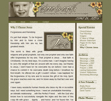
And here’s what the original design looked like:
Wow! If you’ve read this far, I’m impressed!
~s


